How to test
Color & contrast
Testing color contrast is a simple yet crucial step in ensuring content is perceivable for users with low vision and color blindness.
1 General requirements
The Web Content Accessibility Guidelines (WCAG) provide very specific color contrast requirements:
- Normal text (up to 18pt/24px or 14pt/18.5px if bold) must have a contrast ratio of at least 4.5:1 between the text color and background color.
- Large text (at least 18pt/24px or 14pt/18.5px if bold) must have a contrast ratio of at least 3:1 between the text color and background color.
- Meaningful graphics, user interface components and their various states, as well as focus indicactors must have a contrast ratio of at least 3:1 with the background color.
- Exceptions: Logos, incidental or decorative text and graphics, and disabled controls do not need to meet color contrast requirements.
2 How to test
Automated scanning
Automated scanning tools, such as WAVE, Lighthouse, or Deque’s Axe DevTools are a great starting point for color contrast testing. All of these tools can run page scans that quickly generate reports identifying color contrast issues. Scans are:
- Good at identifying simple issues like solid colored text on solid colored backgrounds that do not meet contrast ratios.
- Bad at idenitfying anything more complex like text on background images, gradients, and different states for user interface components (like hover or focus) that do not meet contrast ratios.
Manual testing
Automated scanning must be complemented with a manual review of the page.
Getting started
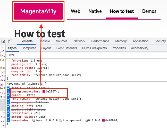
- Open DevTools in your browser window (F12)
- Right-click and select “Inspect” on the different color combinations that you see as you move from the top of the page on down
- Find the hexidecimal color values in the “Styles” tab of your DevTools window (see example image below)
- Enter the hex values into a contrast checking tool (like WebAIM Contrast Checker or Deque’s Color Contrast Analyzer) to see if they meet contrast requirments.
Hover to inspect
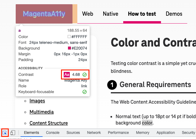
- Chrome has an “Inspect Element by Mouse” DevTools feature that is useful for checking contrast
- Click the button located in the upper left-hand corner of your DevTools window to enable the feature
- Hover over elements on the page with your cursor
- A popup will appear that often indicates whether the element passes contrast by displaying a green check mark within a circle (see example image below)
Background images and gradients
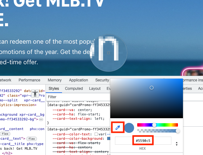
- Identify instances of text and user insterface elements that sit on top of background images or color gradients
- Use a color picker tool to get representative hex codes from the background
- In Chrome’s DevTools, under the “Styles” tab you can click on any of the color boxes to bring up the Color Picker popup
- Within the popup, activate the eyedropper icon
- Hover over the desired area on the background image with your cursor and click
- The hex value will be displayed in the Color Picker (see example image below)
State changes
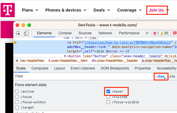
- Identify interactive elements that change color based on their states, such as focus or hover
- Ensure that the state changes meet contrast requirements
- You can force some state changes to persist, which makes them easier to check
- Inspect the desired element
- In Chrome’s DevTools, under the “Styles” tab, activate the “:hov” toggle button
- Select the checkbox with desired state
- This will force a persistent state and allow you to check for contrast on the element (see example image below)
Browsers
- Any major browser (Chrome, Safari, Firefox) is acceptable for color contrast testing.
3 What to test for
✓ Ensure text has sufficient contrast to the background color
| Pass | Fail |
|---|---|
|
This text passes contrast |
This text does NOT pass contrast |
|
This text is large enough that it only has to meet a 3:1 color ratio |
This text is the same color but smaller, and fails to meet a 4.5:1 color ratio |
✓ Ensure text over images and color gradients has sufficient contrast
Note: All of the text must have sufficient color contrast.| Pass | Fail |
|---|---|
|
This text passes contrast |
This text does NOT pass contrast |
✓ Ensure that the different states of user interface components have sufficient contrast
Note: Default state, keyboard focus state, and hover state
| Pass | Fail |
|---|---|
✓ Ensure meaningful graphical objects have sufficient contrast to their background
Note: 3:1 color contrast ratio
| Pass | Fail |
|---|---|
| ↻ | ↻ |
✓ Ensure color alone is not used to convey information
Note: Use of additional visual cues that do not rely on color alone
| Pass | Fail |
|---|---|
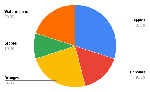
|
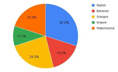
|
Related WCAG
- 1.4.3 Contrast
- 1.4.11 Non-text Contrast
- 1.4.1 Use of Color